There are many things announced in Google I/O 2015, that we are still absorbing, one of them are Google’s new Android M Developer preview. Just like lollipop, Developer preview is also made available for latest Android M. Full form of M is still kept secret and should be revealed with next Nexus phone.
Rumors are that two versions of next nexus are being made, one by LG which has a smaller body like Nexus 5, and second one is being made by Huawei which is a phablet like Mate 7. Coming back to the topic, Google didn’t changed the overall look of android with M, but the launcher has been changed quite a bit.

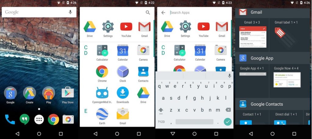
The app drawer now has a search option, and the scrolling in now converted from horizontal to Vertical scrolling. All the apps are sorted by name from A to Z. Instead of making pages of the apps, that can be scrolled horizontally in Lollipop, Now you have a continues stream of apps scroll-able vertically. May be you dislike it or welcome it, there is a significant chance that Google is going to keep this layout in the final build of Android M.
Though the developer preview is not the final build, we know, but Google is very likely to keep this layout in final build just like it did with Lollipop. The new drawer layout also has the alphabets listed to the left, There isn’t any way to quickly scroll by swiping the alphabets, like you can do in the contacts app.
If you are a fan of Google Now launcher, you will miss the Google Now. Because it is now removed from the left of home screen. Now you can not access Google Now by swiping to the left most. If you want to access the Google now, you have to enable it via Launcher settings and then you can access it by long tap on home screen.
Above the apps, you get a dedicated section for your four most used apps, The order of these apps and the apps themselves are selected by the launcher and you can not change it. Google thinks it is more convenient, but these apps should have been near the bottom of screen, as it becomes really hard to stretch to the top of screen, considering the fact that Smartphone’s are becoming bigger and bigger very day.
At the end, I personally liked the updated launcher as I like the vertical scrolling drawer. Just like the HTC Sense has to offer. Tell us in the comment section below, whether you liked or disliked it. Remember that this is not yet a final build, and Google may listen to your voice if you didn’t liked it.
Share this story with your friends on Facebook, your followers with twitter and Google+. Join Us on Facebook, twitter and Google+ to show your support.

